Pie Charts
Pie charts are used to display a single categorical variable.
The pie() function takes a Frequency table as input. You can either create the table first and then pass it to the pie() function or you can create the table directly in the pie() function.
The data for the examples below comes from the mtcars dataset. The two categorical variables, cylinders and gears are used to show how to create side-by-side pie charts.
Pie Chart Using a Dataset
pie(table(mtcars$cyl), col=grey.colors(3), main="Number of Cylinders in the 1974 Motor Trend Dataset")
Pie Chart With a Legend
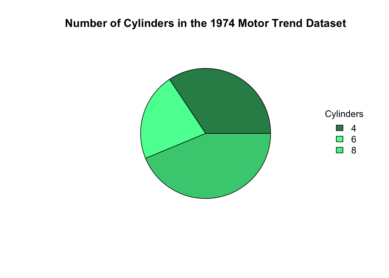
pie(table(mtcars$cyl), col=c("seagreen", "seagreen1", "seagreen3"), main="Number of Cylinders in the 1974 Motor Trend Dataset", labels=c("","","") )

legend("right",legend=levels(as.factor(mtcars$cyl)), fill=c("seagreen", "seagreen1", "seagreen2"), title="Cylinders", box.lty=0)
Pie Chart With Your Own Data
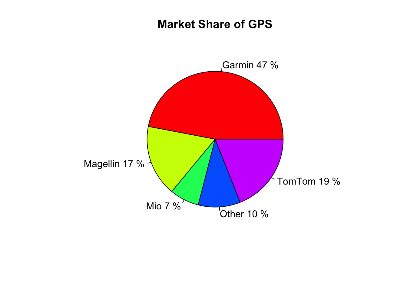
Company <- c("Garmin", "Magellin", "Mio", "Other", "TomTom");
Percent <- c(47, 17, 7, 10, 19);
pie(x = Percent, label=paste(Company, Percent, "%"), col=rainbow(length(Company)), main="Market Share of GPS" ) 
Pie Chart With Your Own Data and a Legend
Company=c("Garmin", "Magellin", "Mio", "Other", "TomTom");
Percent=c(47, 17, 7, 10, 19);
pie(x=Percent, label = "", col = rainbow(length(Company)), main = "Market Share of GPS" )

legend("right",legend=Company, fill=rainbow(length(Company)))
Mathematicss, Computer Science, and Statistics Department Gustavus Adolphus College