Bar Charts
Bar Charts are used to display the distribution of a single categorical variable.
All of the plots below use tools from the ggplot2 and
dplyr packages.
library(ggplot2)  # Loads the ggplot2 library
library(dplyr)  # Loads the dplyr library
Bar Chart
The code below uses the class variable in the
mpg dataset to create a bar chart with blue bars, a title,
an x-axis label, and a legend.
mpg %>%
  ggplot( aes(x = class)) +
    geom_bar(fill = "blue") +
    labs(
      title = "Distribution of Automobile Classs",
      x = "Automobile Class"
      ) +
    theme_bw()
The bars can be displayed vertically by adding
coord_flip() to the previously created plot.
mpg %>%
  ggplot( aes(x = class)) +
    geom_bar(fill = "blue") +
    labs(
      title = "Distribution of Automobile Classs",
      x = "Automobile Class"
      ) +
    theme_bw() +
    coord_flip()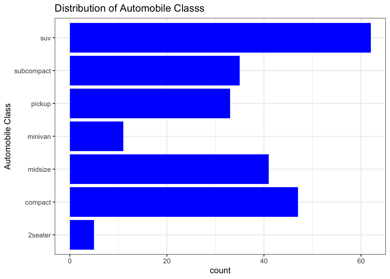
Bar Chart with Relative Frequency
The code below produces a bar chart that has relative frequency instead of frequency on the y axis.
mpg %>%
  ggplot( aes(x = class, y = ..prop.., group = 1)) +
    geom_bar(fill = "blue") +
    labs(
      title = "Distribution of Automobile Classs",
      x = "Automobile Class"
      ) +
    theme_bw()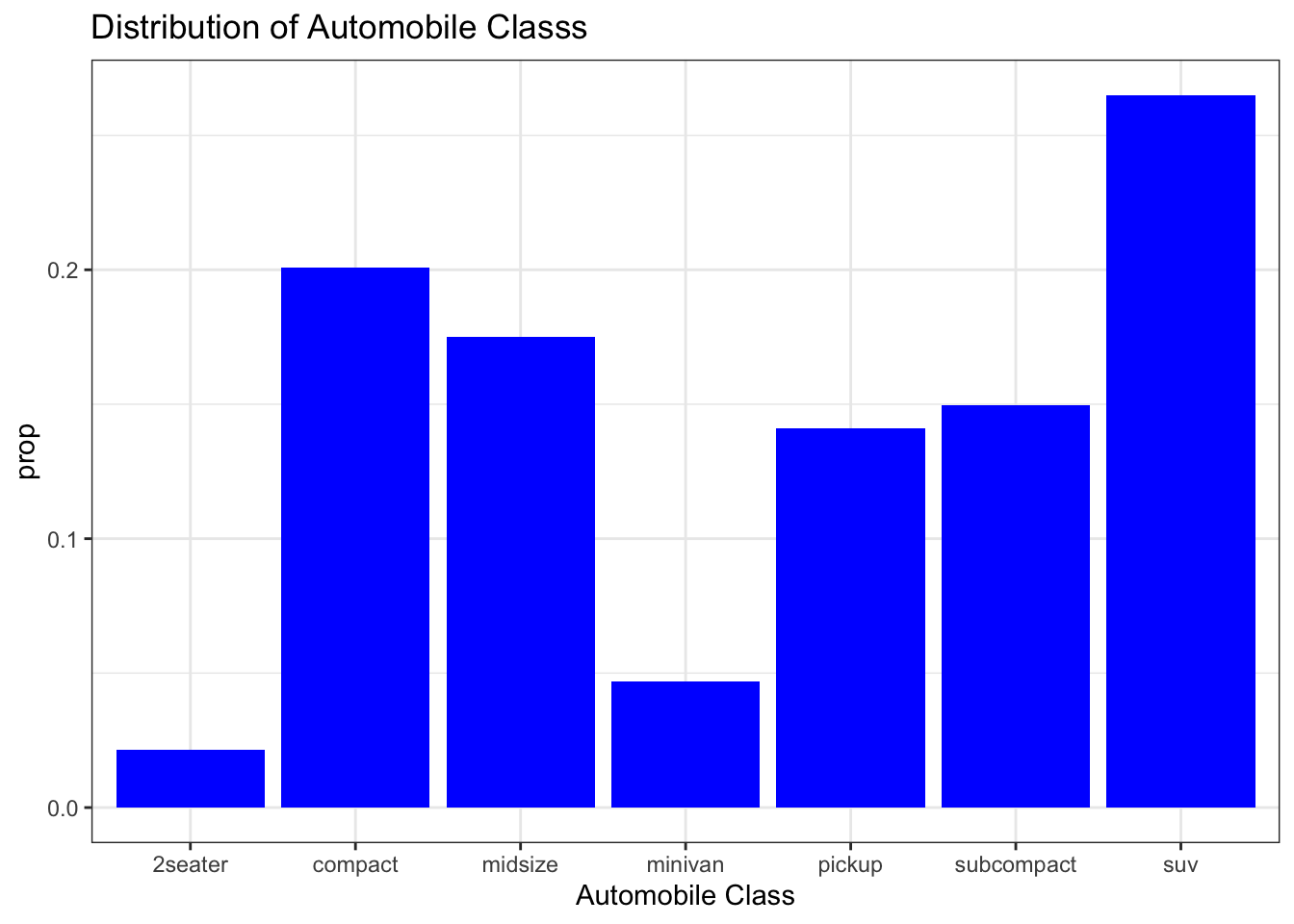
Stacked Bar Chart
mpg %>%
  ggplot( aes(x = "", fill = class)) +
    geom_bar(color = "white") +
    labs(
      title = "Distribution of Automobile Classs",
      x = ""
      ) +
    theme_bw()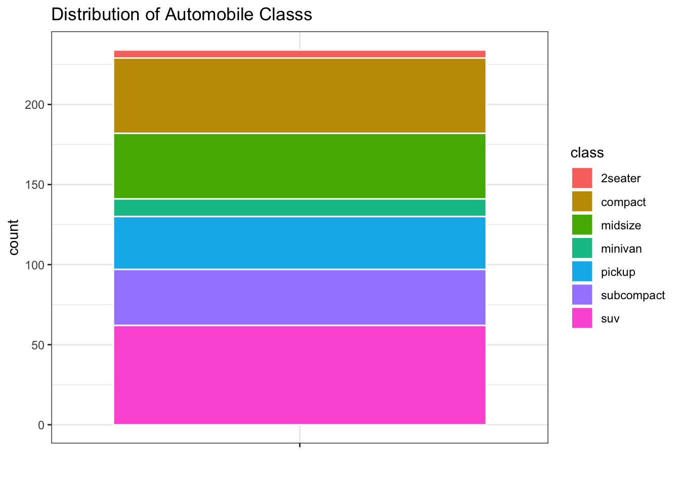
Side-By-Side Bar Chart
Side-by-side bar charts are used to display the relationship between a categorical explanitory variable and a categorical response variable.
The code below creates side-by-side bar chars of drive train type for all of the automobile class.
mpg %>%
  ggplot( aes(x = class, fill = drv)) +
    geom_bar(position = "dodge") +
    labs(
      title = "Distribution of Automobile Classs",
      x = "Automobile Class",
      fill = "Drive Train"
      ) +
    theme_bw()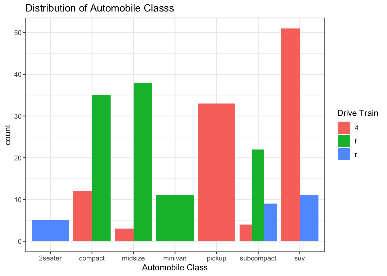
mpg %>%
  ggplot( aes(x = "", fill = drv)) +
    geom_bar(position = "dodge") +
    labs(
      title = "Distribution of Automobile Classs",
      x = "Automobile Class",
      fill = "Drive Train"
      ) +
  facet_grid(. ~ class)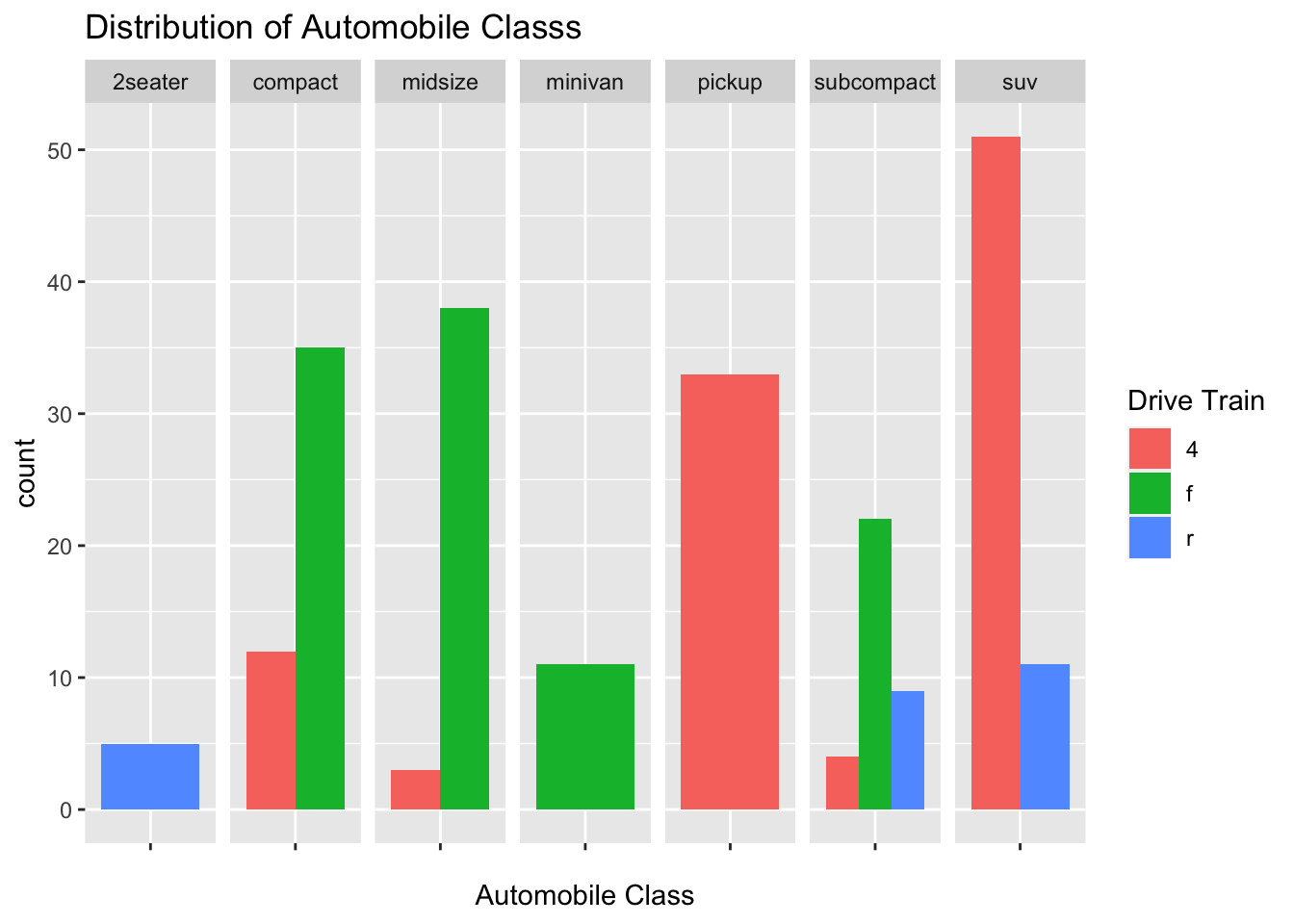
Stacked Bar Charts
The code below creates stacked bar charts for the drive train type of all of the automobile classs
mpg %>%
  ggplot( aes(x = class, fill = drv)) +
    geom_bar() +
    labs(
      title = "Distribution of Automobile Classs",
      x = "Automobile Class",
      fill = "Drive Train"
      ) +
    theme_bw()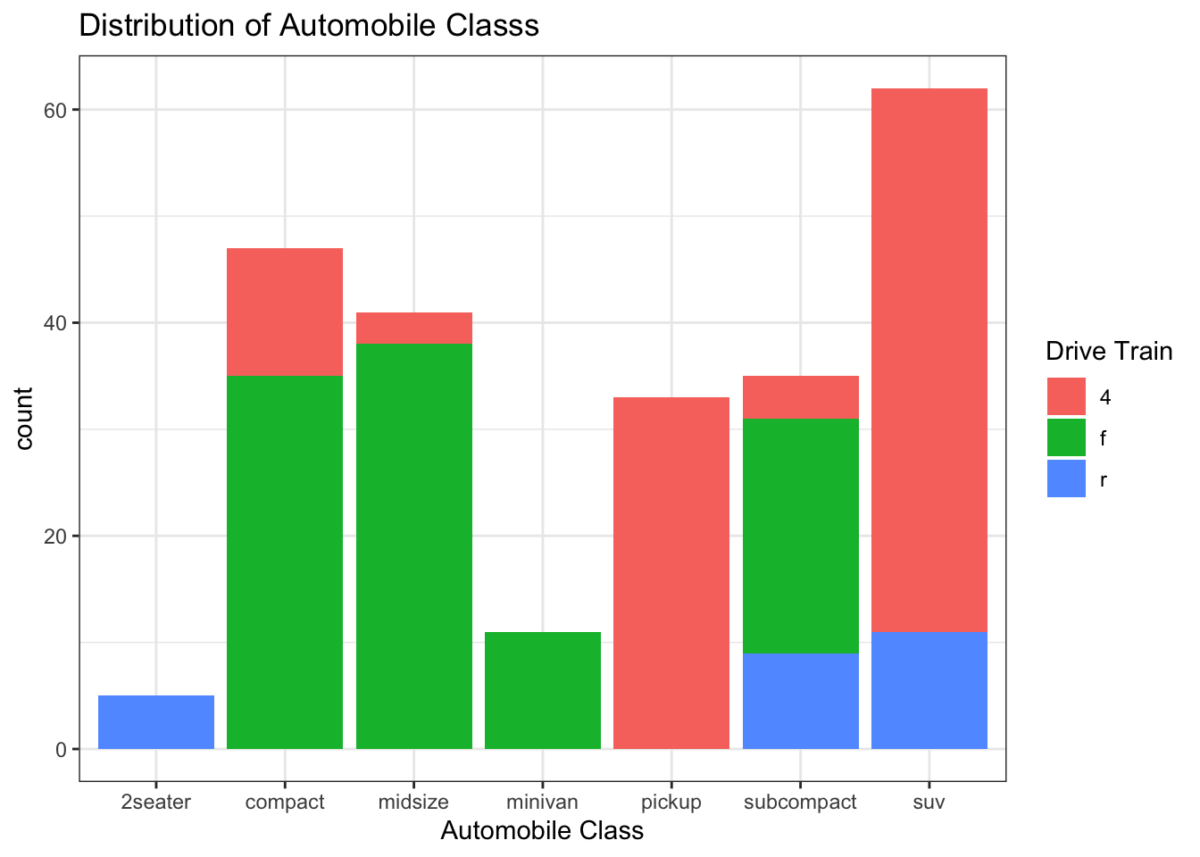
Stacked Bar Chart with Relative Frequencies
The code below creates stacked bar charts with relative frequencies
for the drive train type of all of the automobile classs A mosaic
plot should be used when there are an unequal number of cars within
each class of cylinder.
mpg %>%
  ggplot( aes(x = class, fill = drv)) +
    geom_bar(position = "fill") +
    labs(
      title = "Distribution of Automobile Classs",
      x = "Automobile Class",
      fill = "Drive Train"
      ) +
    theme_bw()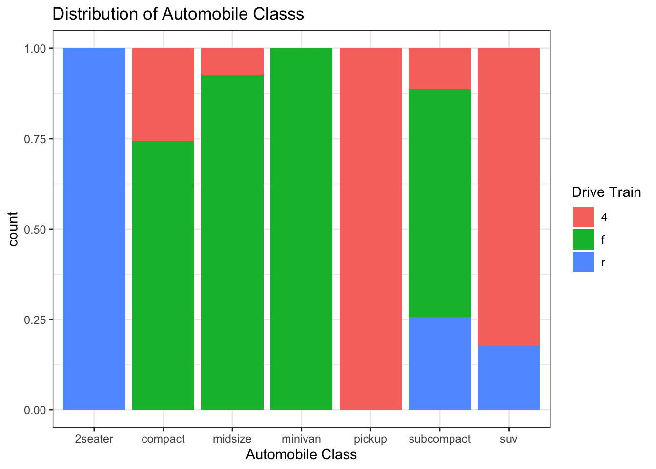
Mathematicss, Computer Science, and Statistics Department Gustavus Adolphus College