Pie Charts
Pie charts are used to display the distribution of a single categorical variable.
All of the plots below use tools from the ggplot2 and
dplyr packages.
library(ggplot2)  # Loads the ggplot2 library
library(dplyr)  # Loads the dplyr library
Pie Chart
Below is the code used to create a pie chart of the
class variable from the mpg dataset that is
part of the ggplot2 package. .
mpg %>%
  ggplot(aes(x = "", fill = class)) +
  geom_bar(position = "fill", width = 1) +
  coord_polar(theta = "y") +
  labs(
    title = "Automobile Class",
    x = "",
    y = ""
) 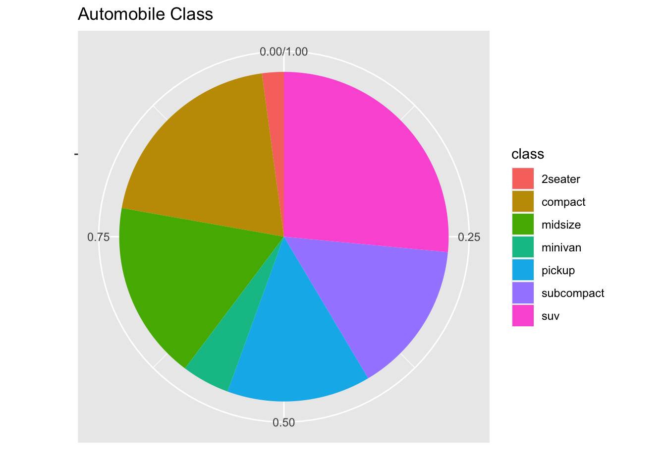
The extranious numbers and lines around the pie chart can be removed
using the theme() arguement.
mpg %>%
  ggplot(aes(x = "", fill = class)) +
  geom_bar(position = "fill", width = 1) +
  coord_polar(theta = "y") +
  labs(
    title = "Automobile Class",
    x = "",
    y = ""
  ) +
  theme(
    panel.grid = element_blank(),
    axis.ticks = element_blank(),
    axis.text.x=element_blank(),
    panel.border = element_blank())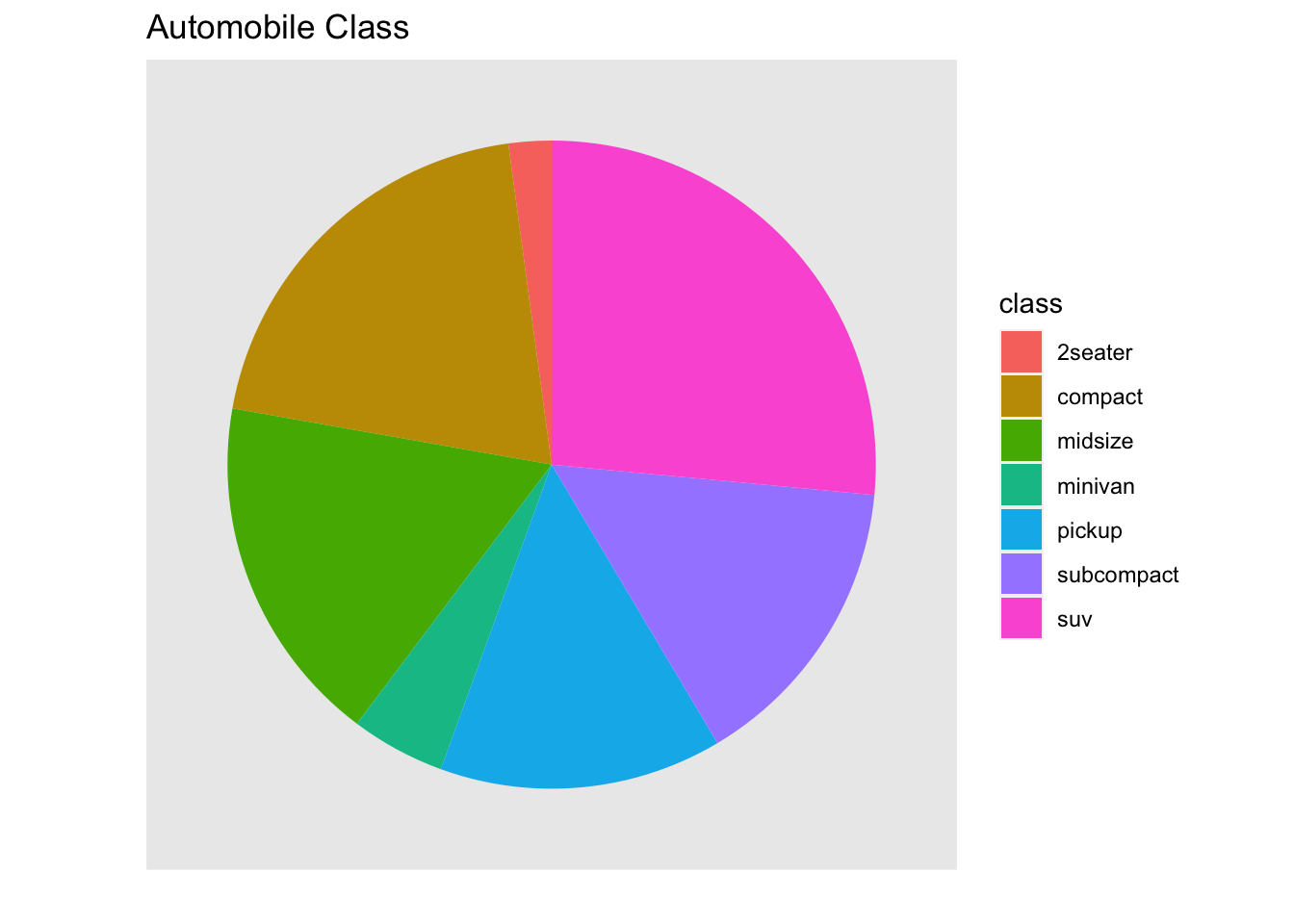
Multiple Pie Charts
Below is the code used to create side-by-side pie charts of
automobile class separated by drive train using the mpg
dataset that is part of the ggplot2 package.
mpg %>%
  ggplot(aes(x = "", fill = class)) +
  geom_bar(position = "fill", width = 1) +
  coord_polar(theta = "y") +
  labs(
    title = "Automobile Class by Drive Train",
    x = "",
    y = ""
  ) +
  theme(
    panel.grid = element_blank(),
    axis.ticks = element_blank(),
    axis.text.x=element_blank(),
    panel.border = element_blank()
    ) +
  facet_grid(. ~ drv)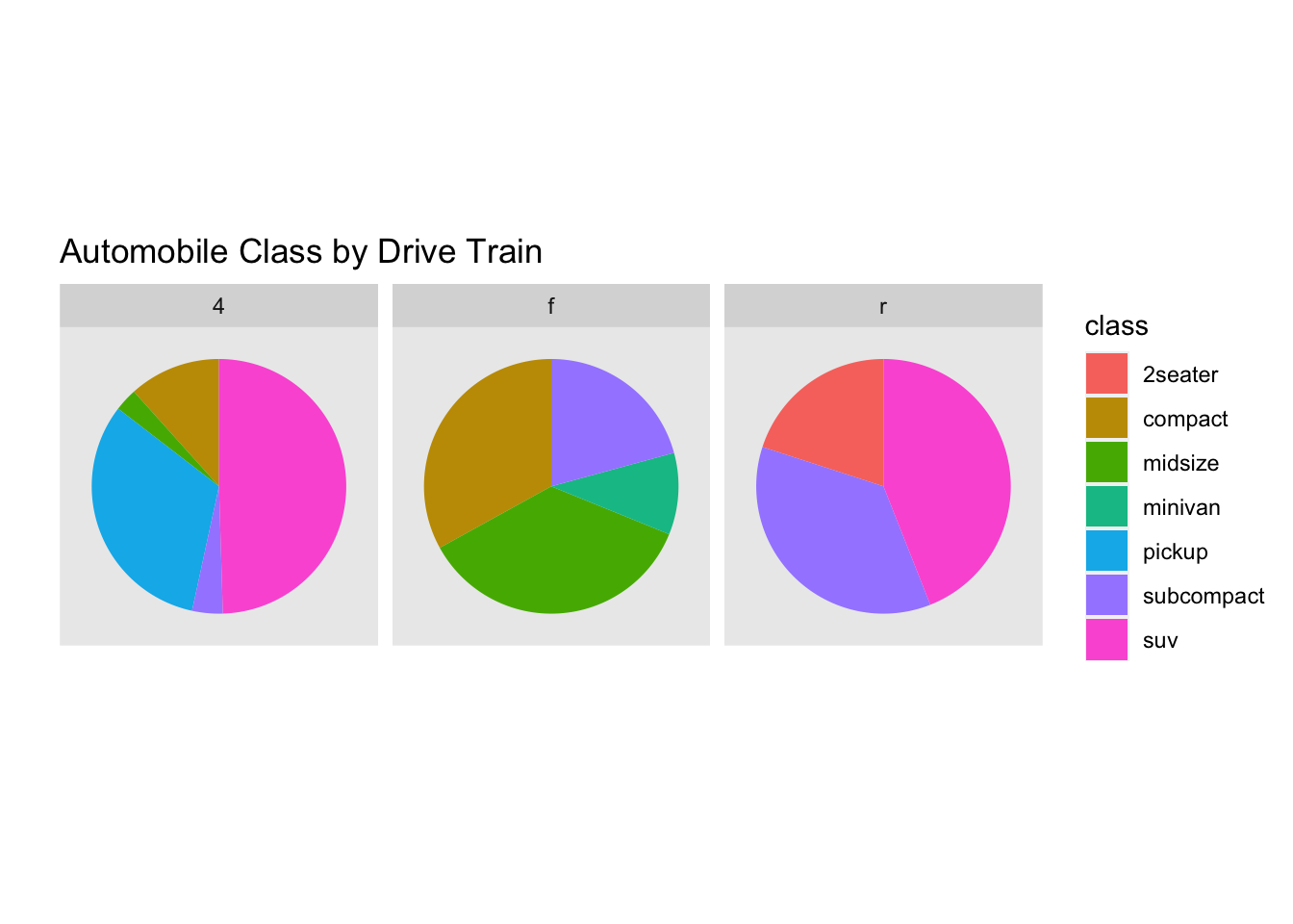
Mathematicss, Computer Science, and Statistics Department Gustavus Adolphus College