Scatterplots
Scatterplots are used to display the relationship between two quantitative variables.
Scatterplot Using a Dataset
# The data comes from the mtcars dataset
# The syntax is plot(y ~ x)
plot(data = mtcars, drat ~ qsec, ylab="Rear Axle Ratio", xlab="Quarter Mile Time (seconds)", main="Scatterplot") 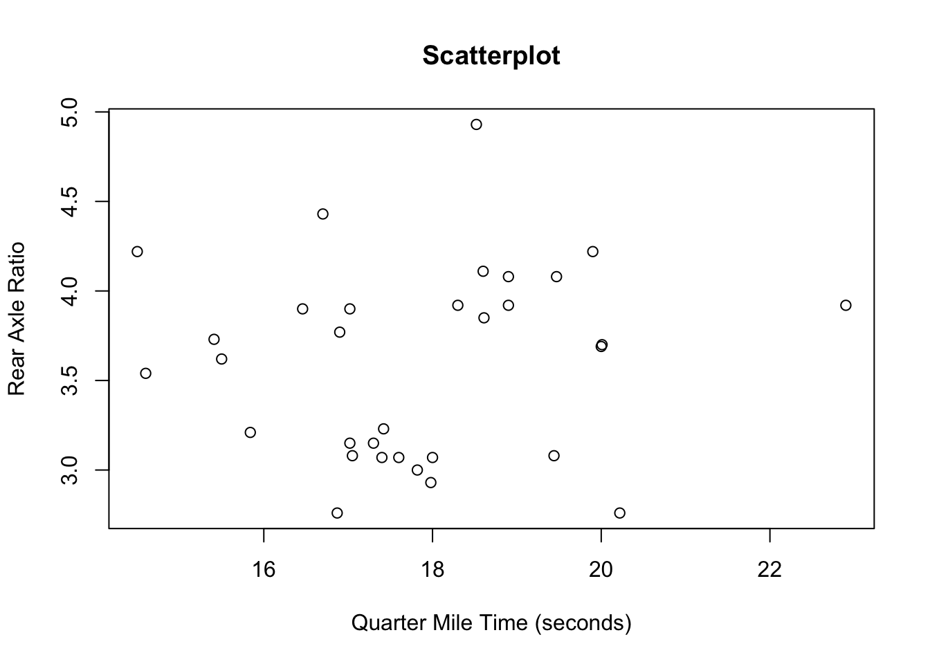
Scatterplos with Regression Lines
To add a regression line to a scatterplot you must create the scaterplot, fit a regression line, and then add the model to teh scatterplot.
plot(data = mtcars, drat ~ qsec, ylab="Rear Axle Ratio", xlab="Quarter Mile Time (seconds)", main="Scatterplot")
my.reg <- lm(data = mtcars, drat ~ qsec)
abline(my.reg)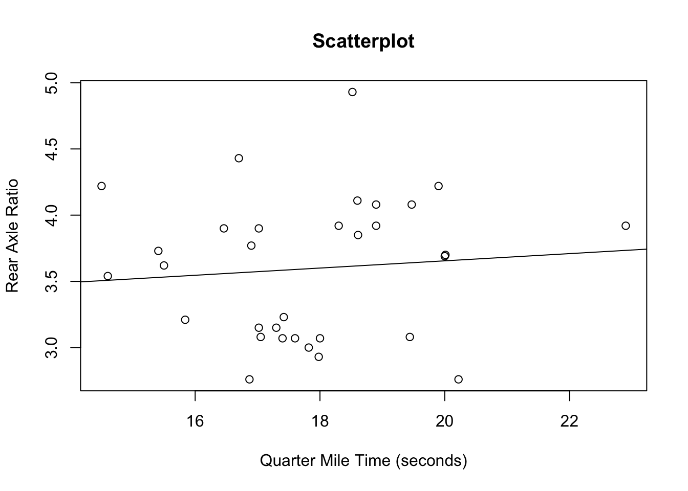
Scatterplot with Color
# The data comes from the mtcars dataset
# The syntax is plot(y ~ x)
plot(data = mtcars, drat ~ qsec, ylab="Rear Axle Ratio", xlab="Quarter Mile Time (seconds)", main="Scatterplot", col=cyl, pch=19)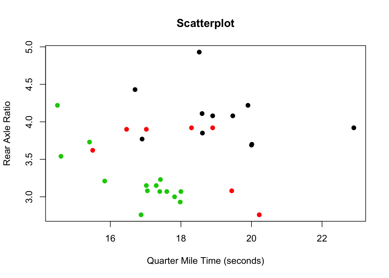
Scatterplot with Shapes
# The data comes from the mtcars dataset
# The syntax is plot(y ~ x)
plot(data = mtcars, drat ~ qsec, ylab="Rear Axle Ratio", xlab="Quarter Mile Time (seconds)", main="Scatterplot", type = "n");
points( drat ~ qsec, data= subset(mtcars, cyl == 4), pch = 13)
points( drat ~ qsec, data= subset(mtcars, cyl == 6), pch = 14)
points( drat ~ qsec, data= subset(mtcars, cyl == 8), pch = 15)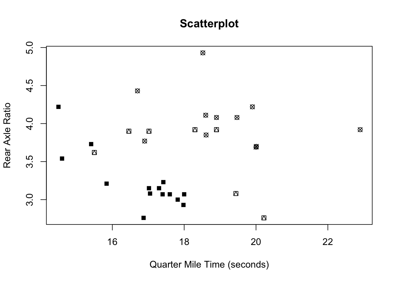
Mathematicss, Computer Science, and Statistics Department Gustavus Adolphus College