Line Graph
Scatterplots are used to display the relationship between a quantitative response variable and an ordered explanitory variable. Connecting the points in a scatterplot with lines produces a line graph. Line graphs are commonly used with financial data or when Time is the explanatory variable.
A Simple Line Grap
The code below uses the USPersonalExpenditure dataset to create a simple line graph with Year on the x-axis and U.S. Personal Expenditures in billions of dollars on the y-axis. There are separate lines for each type of personal expenditure.
library(ggplot2)
line_plot <- data_tbl %>%
  ggplot(aes(x = Year, y = Amount, color = Expenditure, group = Expenditure)) +
    geom_line() +
    xlab("Year") +
    ylab("Billions of Dollars")  +
    ggtitle("U. S. Personal Expenditures")
line_plot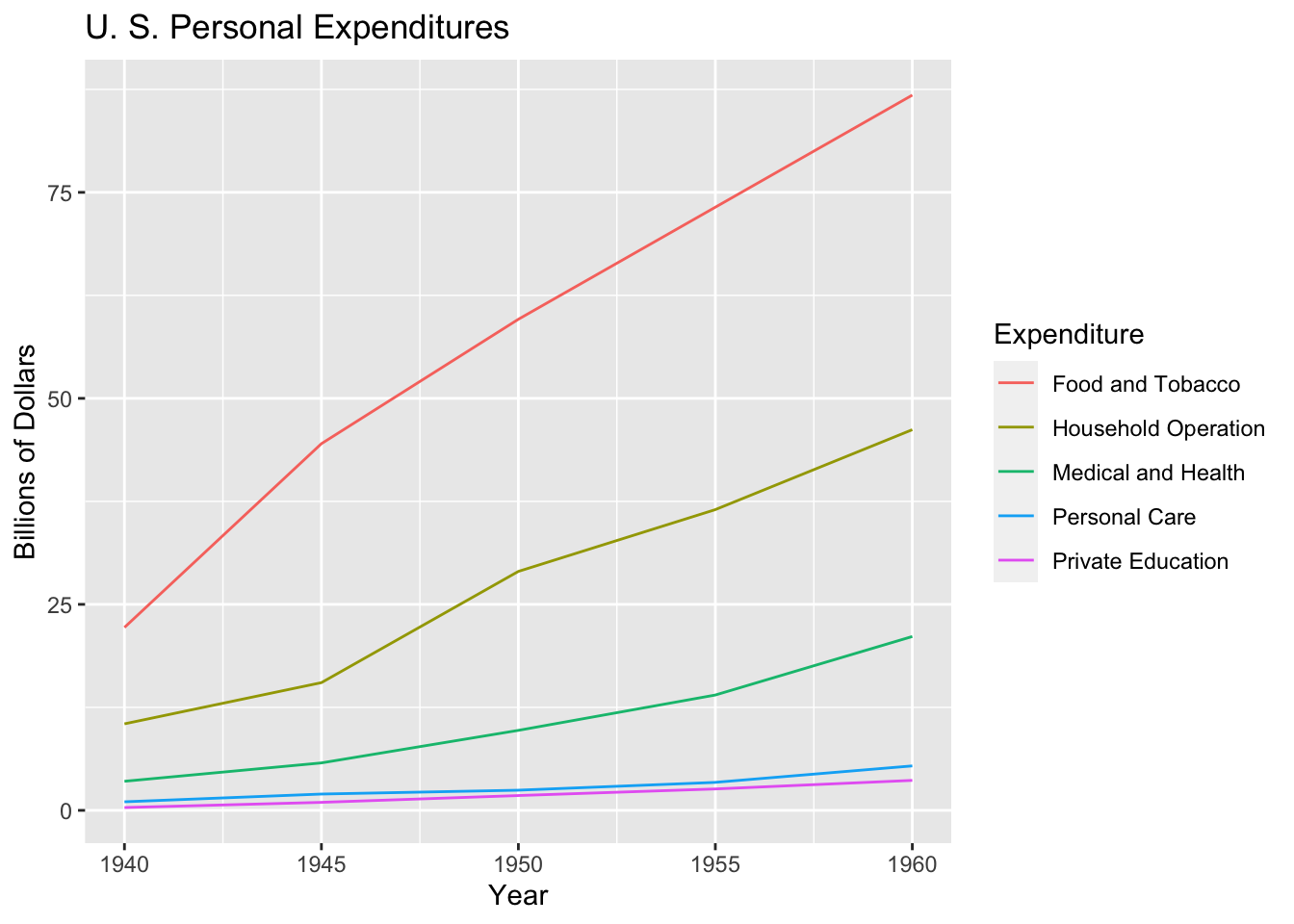
You can add points to the plot with the geom_point() function
line_plot + geom_point()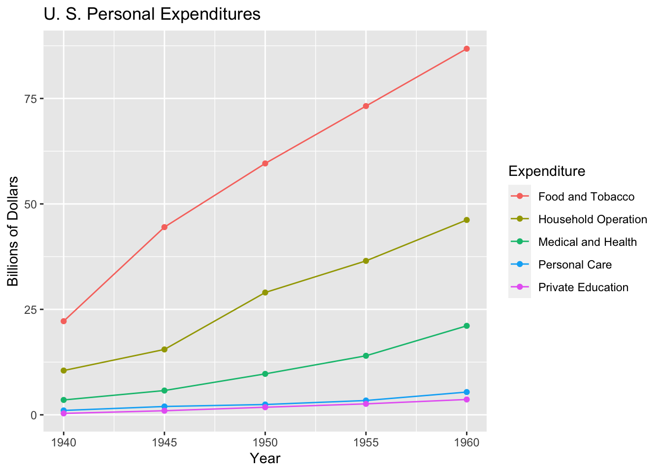
Mathematicss, Computer Science, and Statistics Department Gustavus Adolphus College