Scatterplots
Scatterplots are used to display the relationship between a quantitative response variable and a quantitative explanitory variable.
Simple Scatterplot
The code below creates a simple scatterplot with blue points, a title, an x-axis label, and a y-axis label.
library(ggplot2)
my.plot <- ggplot(data = mtcars, aes(x = qsec, y = drat)) + geom_point(color = "blue") +
  ggtitle("Rear axle ratio vs 1/4 Mile Time") +
  xlab("Time (sec)") +
  ylab("Rear Axle Ratio")
my.plot 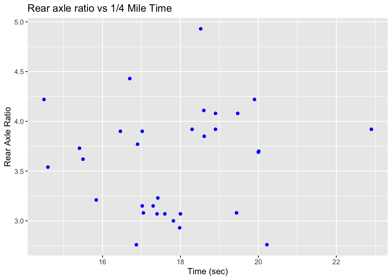
Scatterplots and Regressions lines
ggplot2 allows you to fit a regression line to a scatterplot without actually fitting a regression model. By default the geom_smooth(method = "lm") function will add the simple linear regression line with standard error bars to the scatterplot. You can fit the regression line without error bars by using geom_smoth(method = "lm", se = FALSE).
my.plot + geom_smooth(method = "lm")## `geom_smooth()` using formula 'y ~ x'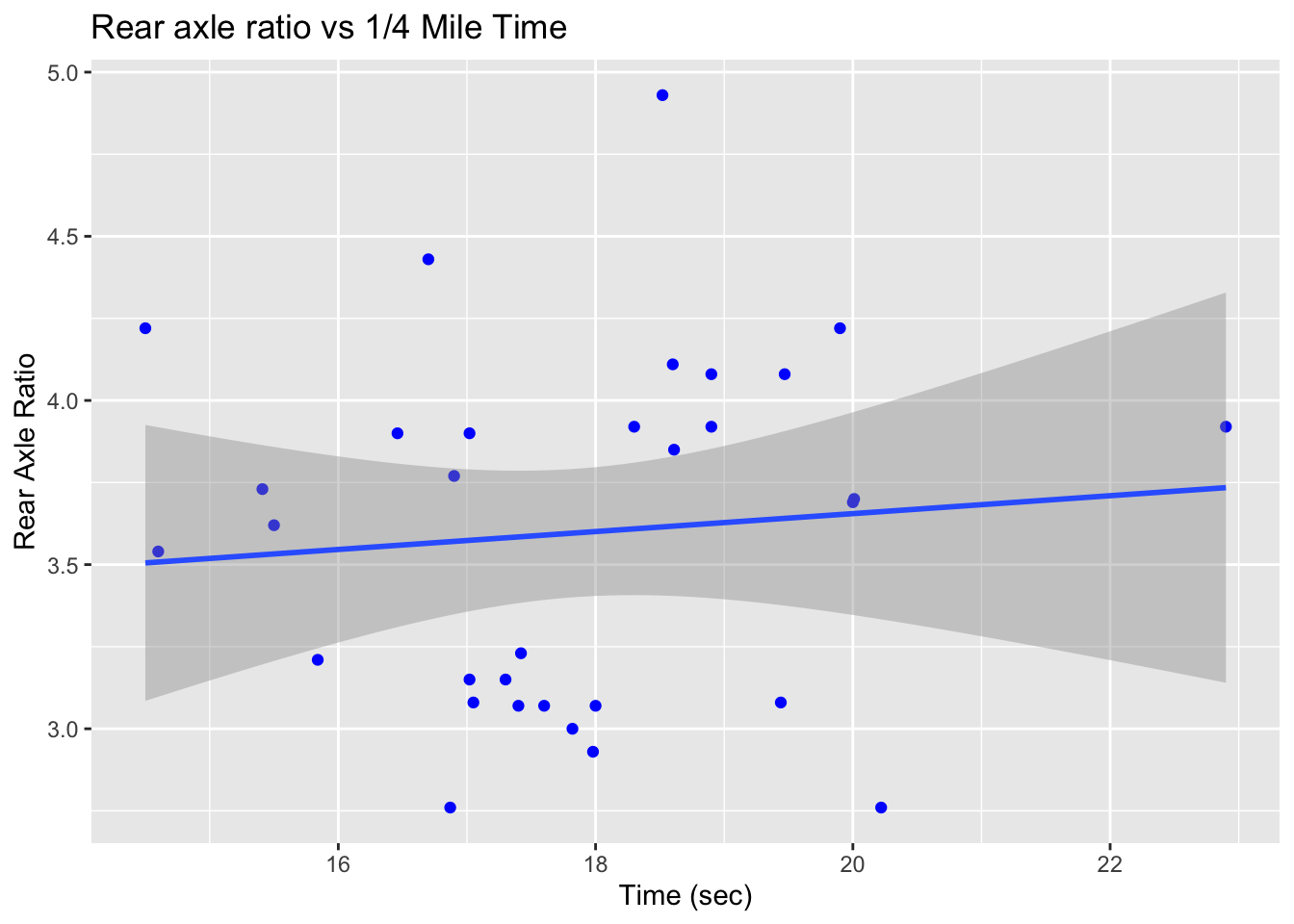
Scatterplots with Additional Features
The color of the points is just one aspect of the plot that can be changed. The shape, size, and density of the color can also be manipulated. The graph below changes the color of the point based on how many cylinders are in the car.
library(ggplot2)
my.plot <- ggplot(data = mtcars, aes(x = qsec, y = drat )) +
  geom_point(aes(color = factor(cyl)) ) +
  ggtitle("Rear axle ratio vs 1/4 Mile Time") +
  xlab("Time (sec)") +
  ylab("Rear Axle Ratio") +
  scale_color_discrete(name="Cylinders")
my.plot 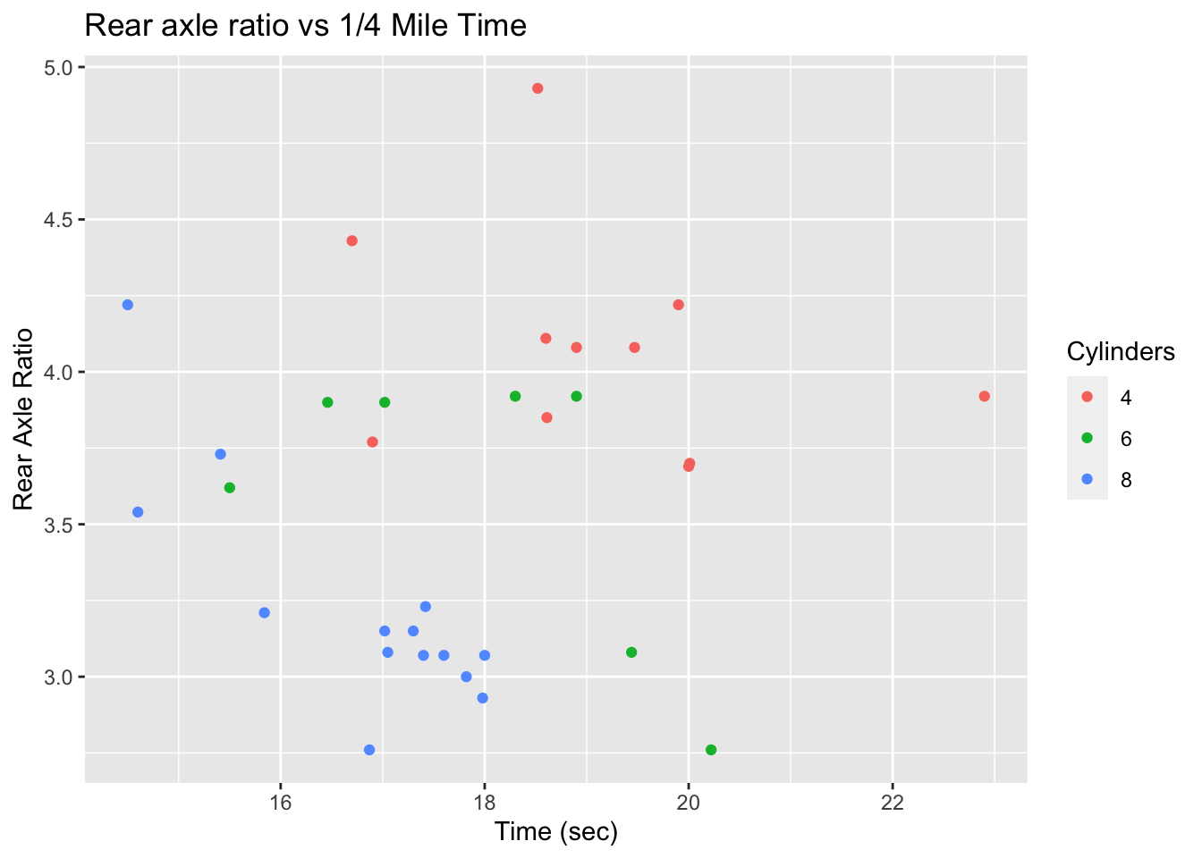
The following code produces a plot with purple points that are larger than the points displayed by default. The shape of the point is determined by the number of cylinders the car has. Additionally, regions of the scatterplot that contain more data are shaded darker than the regions that contain less data. This is determined by the alpha argument.
library(ggplot2)
my.plot <- ggplot(data = mtcars, aes(x = qsec, y = drat, shape = factor(cyl) )) +
  geom_point(color = "purple", size = 10, alpha = .3) +
  ggtitle("Rear axle ratio vs 1/4 Mile Time") +
  xlab("Time (sec)") +
  ylab("Rear Axle Ratio") +
  scale_shape_discrete(name="Cylinders")
my.plot 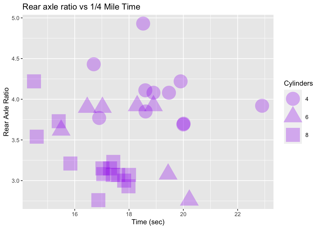
Scatterplot Using plotly
The plotly package adds additional functionality to plots produced with ggplot2. In particular, the plotly package converts any ggplot to an interactive plot. Hover over the points in the plot below. Information from each point should appear as you move the cursor around the scatterplot. You can also zoom in on specific areas of the graph to highlight trends and.
library(ggplot2)
library(plotly)
my.plot2 <- ggplot(data = mtcars, aes(x = qsec, y = drat)) + geom_point(color = "blue") +
  ggtitle("Rear axle ratio vs 1/4 Mile Time") +
  xlab("Time (sec)") +
  ylab("Rear Axle Ratio")
ggplotly(my.plot2) # Adds additional functionality to the scatterplot
Mathematicss, Computer Science, and Statistics Department Gustavus Adolphus College