Histograms
Simple Histograms
Histograms are used to display the distribution of a single quantitative variable. The number of bins is calculated automatically, but you should always pick the number of bins that best displays the distribution of the data. You can either set the number of bins to be used with the bins argument, or you can set the width of the bins by using the binwidth argument. Bins are the intervals that cover the x axis. Each bar in the histogram is sitting on a bin.
The code below generates a histogram of gas mileage for the mtcars data set with the default binwidth and color. If you do not supply the number of bins or a binwidth an error message is generated along with the graph.
library(ggplot2)

ggplot(data = mtcars, aes(x = mpg)) +
  geom_histogram() +
  ggtitle("Distribution of Gass Mileage") +
  xlab("Miles per Gallon")
## `stat_bin()` using `bins = 30`. Pick better value with `binwidth`.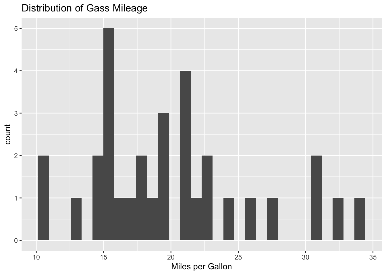
Here the binwidth and fill arguments are used to generate a histogram with the desired specifications.
ggplot(data = mtcars, aes(x = mpg)) +
  geom_histogram(binwidth = 2, fill = "violet") +
  ggtitle("Distribution of Gass Mileage") +
  xlab("Miles per Gallon")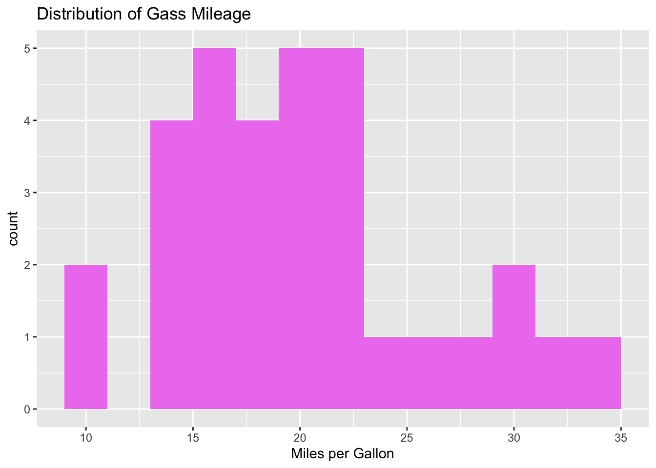
Density Histograms
Sometimes it is nice to display a density curve along with your histogram. The code below generates a density histogram and a density curve of gas mileage for the mtcars data set.
ggplot(data = mtcars, aes(x = mpg)) +
  geom_histogram(aes(y=..density..), binwidth = 2, fill = "blue") +
  geom_density() +
  ggtitle("Distribution of Gass Mileage") +
  xlab("Miles per Gallon")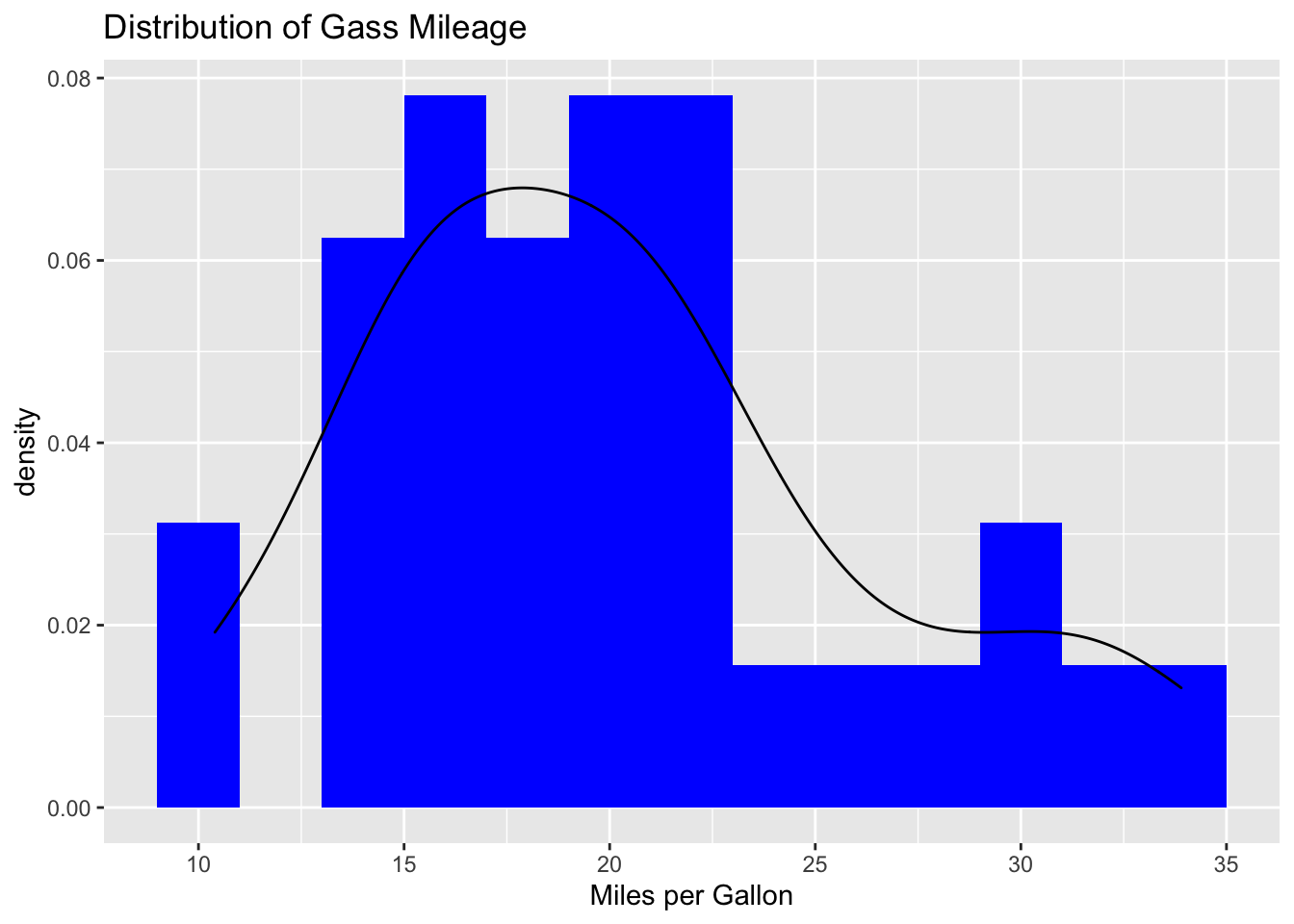
Overlapping Histograms
The code below produces overlapping histograms of gas mileage for cars based on the number of cylinders. The alpha argument is used to make the colors semi transparent.
library(ggplot2)
mtcars$cyl <- factor(mtcars$cyl)

ggplot(data = mtcars, aes(x = mpg, fill = cyl)) +
  geom_histogram(bins = 20, alpha = .7) +
  ggtitle("Distribution of Gass Mileage") +
  xlab("Miles per Gallon") +
scale_fill_discrete(name = "Cylinders") 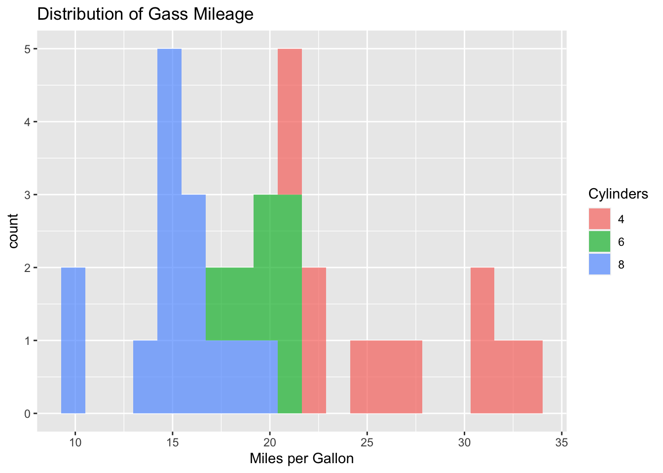
Multiple Histograms
The code below generates separate histograms of gas mileage for cars based on the number of cylinders.
library(ggplot2)
mtcars$cyl <- factor(mtcars$cyl)

ggplot(data = mtcars, aes(x = mpg)) +
  geom_histogram(bins = 20) +
  ggtitle("Distribution of Gass Mileage by Cylinders") +
  xlab("Miles per Gallon") +
  ylab("") +
  facet_grid(. ~ cyl)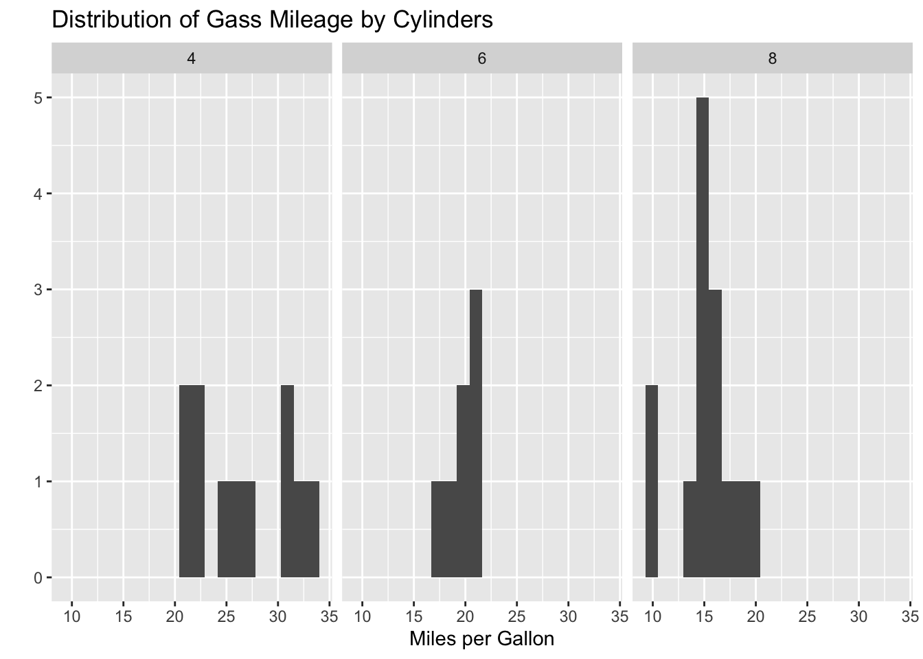
Mathematicss, Computer Science, and Statistics Department Gustavus Adolphus College